NASA Eclipse Soundscape Re-Design

Adding clarity to NASA’s Eclipse Soundscape webpage with WCAG approved standards

timeline

type

strategies used

Nov-Dec 2024 (~4 weeks)
Real Client Project
A/B Testing, Accessibility (WCAG), Collaboration, Information Architecture, Prototyping, Stakeholder-driven work, Usability Testing
skip to solution

overview

Our client NASA is introducing a new role, Data Analyst to their Eclipse Soundscape project site. They want a re-design of the site so that returning and new participants can easily follow through the responsibilities of the role. In the final re-design, my team and I delivered a layout that satisfies accessibility, WCAG, and brand guidelines.

what's the issue?

How might we make the Analyze 2023 Data Section digestible to users? (With the focus making the site screen reader friendly)

The current layout is overwhelming and there were many options on what to fix first. Since the main focus of our client is to promote their upcoming Data Analyst role, my team and I tackled with simplifying the layout to present information in an effective way.

current layout

The main issues with the current layout was that it is:

1. text heavy
2. navigation to the audio analysis section was not obvious to users

understanding our users

We used surveys as a way to gauge our participant’s age, knowledge about screen readers and NASA’s Eclipse Soundscape Project. Then we conducted user testing on the current layout to collect user’s pain points. There was a total of 6 interviews where we watched users navigate, narrate through their navigation. The completion of these tasks were used as metrics to illustrate how effective the current layout was at conveying information.

Users were expected to perform the following tasks throughout the interview:

1. Define what an ES (Eclipse Soundscape) Data Analyst does
2. Navigate to the Audio Analysis section and have no difficulty in toggling each audio clip.

our findings

Based on our user testing, these are some of the metrics and demographic we collected...

Overall, users showed confusion and frustration when navigating the site. Notable comments include:

From the data we obtained from our user testing, we identified the strengths and weaknesses of the Eclipse Soundscape layout to help us narrow down what to focus on when designing.

competitive analysis

To better position ourselves, we analyzed three competitors, focusing primarily on their accessibility features.

steps before ideation

1. Site Map
We created a site map to understand the information architecture of the site. Doing this made it easier to narrow down the different content and components in the current layout.
2. Feature Prioritization
Using the information from our user testing and competitive analysis, we used the 2x2 prioritization matrix to narrow down what features are most feasible.

ideation

In our iterations, we made sure we followed our client's branding guideline to avoid any inconsistencies along the way.

lo-fi prototype

We sketched out potential layouts for the section and then voted on which components and features should be added. During this time, we prioritized revamping the Analyze 2023 Data in the interest of time.

mid-fi prototype

final design

changes made

1. Simplification! Less is more.

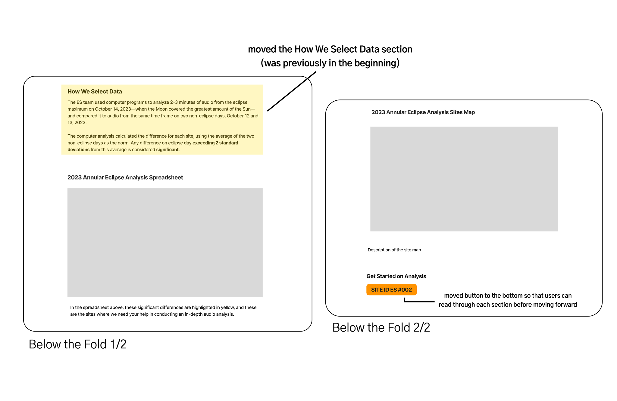
Users are less willing to read about something if they’re bombarded with a bunch of information in their face. Adding space in between paragraphs can give the illusion of more space.

2. Utilized intuitive navigation features.

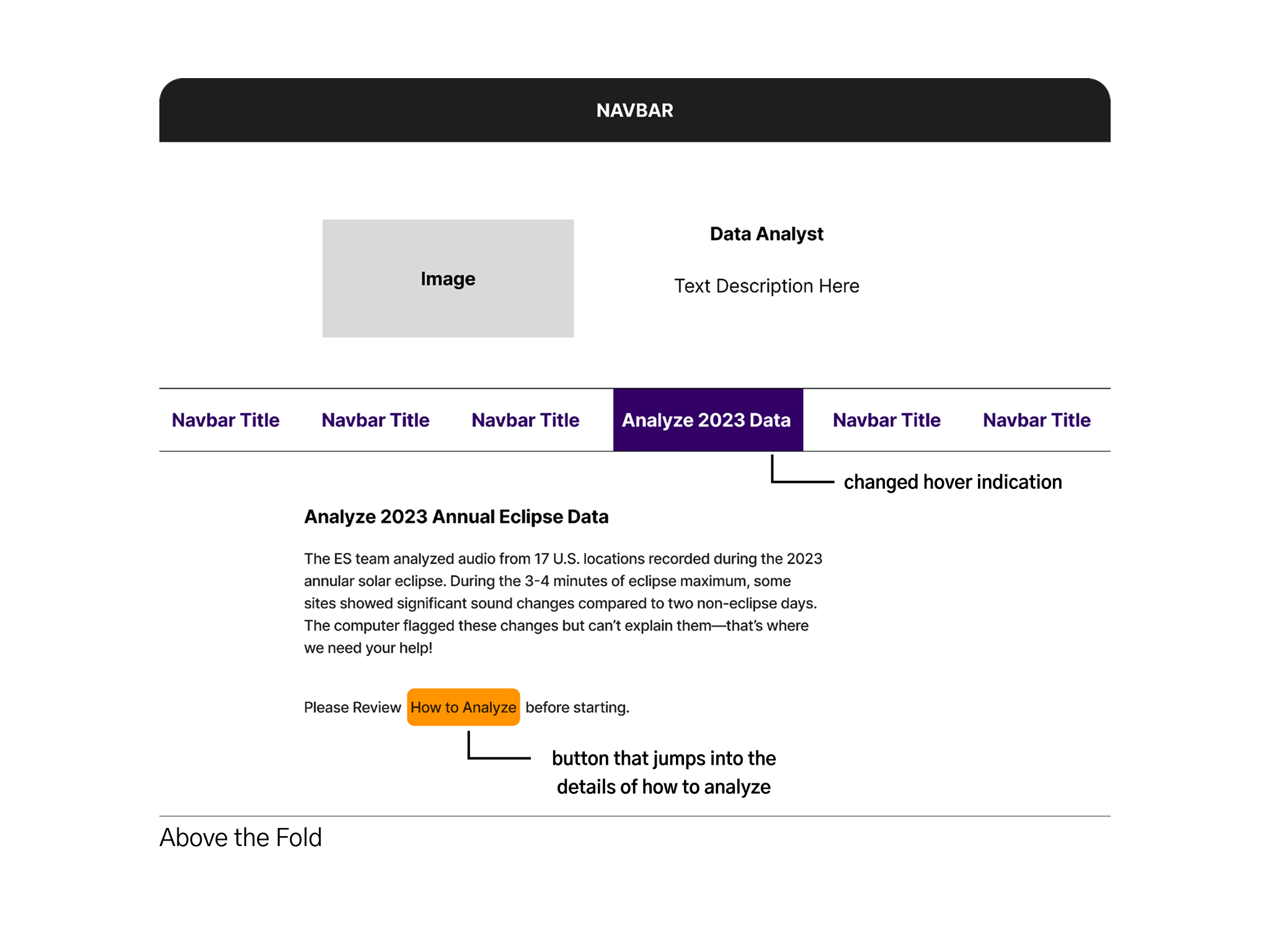
Adding such features like a back button on the left hand side or a button with a hover indication helps users understand what these elements do.

3. One thing at a time.

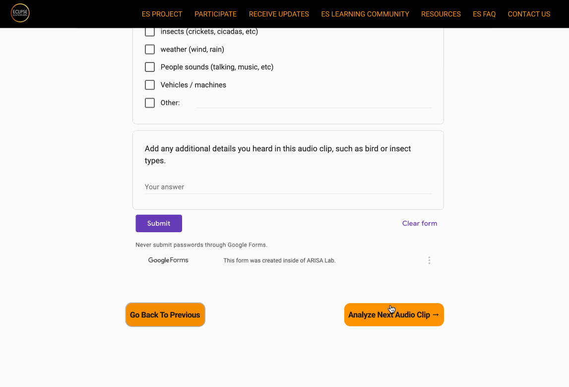
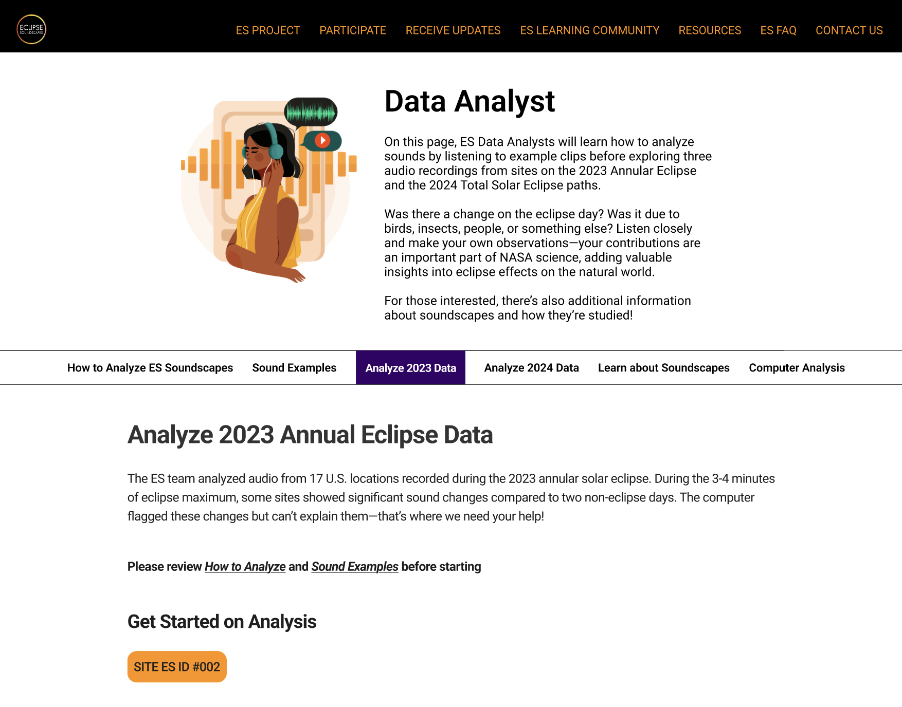
Users don’t have to worry about the different components in their face when performing an analysis. This also ensures users can focus on the current analysis they’re doing - without skipping around.

reflection

Responsiveness and flexibility is crucial in collaborative settings!

Shoutout to my team members for giving in the best effort for each step of the project. Because of this we were able to deliver most of our planned features, especially the audio analysis section.

Learning to compromise due to limitations with client

My team and I had to reconsider some ambitious ideas because our client’s site was built on WordPress. We needed to make sure the ideas we deliver are covered within the client’s budget and WordPress features.

Adding more features for screen readers

Initially, we wanted to focus primarily on making an interface screen reader friendly. However, we realized it was hard to find a group of individuals who used screen readers like VoiceOver in their daily life. But it would’ve been great to have insight about what they prioritize in interface for a seamless user experience.