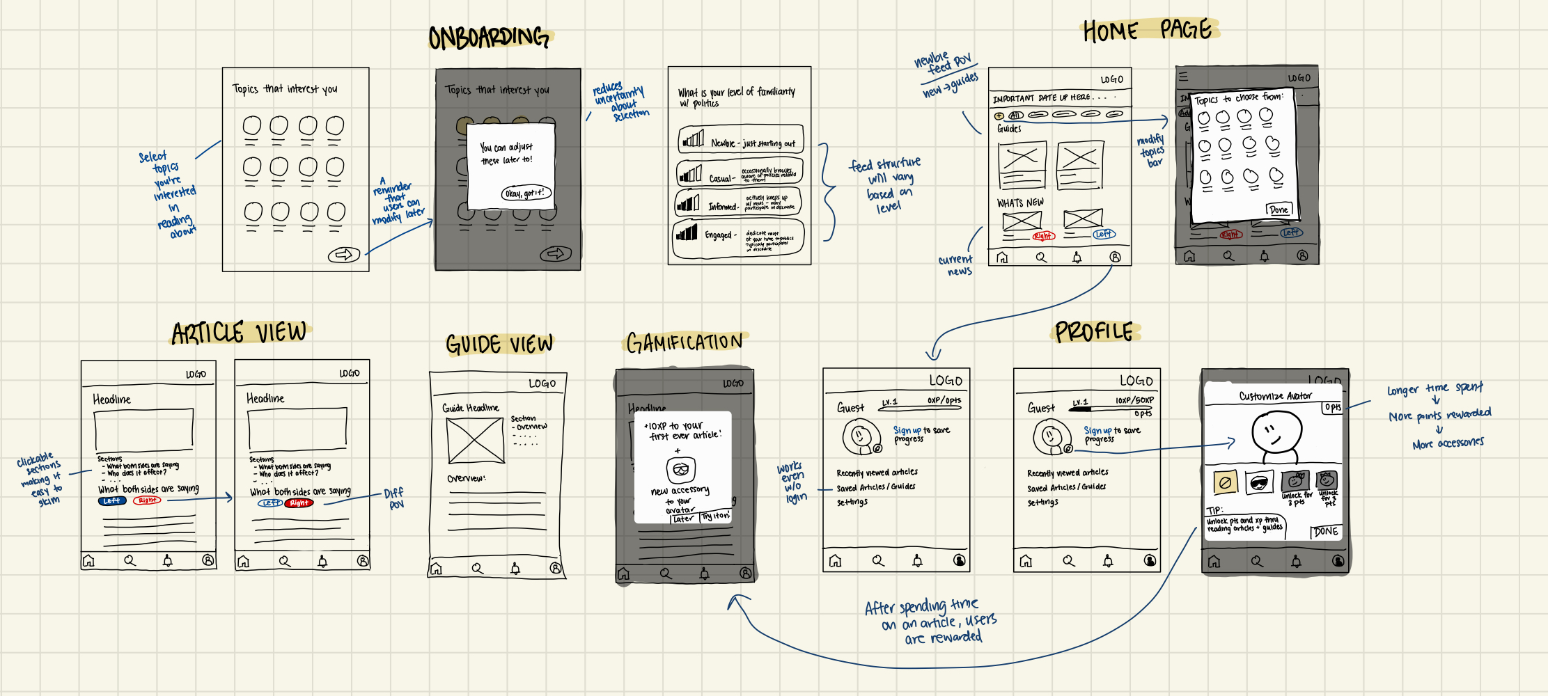
ideation
Based on the information I collected from my competitive analysis and user interviews, I created a low fidelity wireframe to consolidate and visualize my ideas.
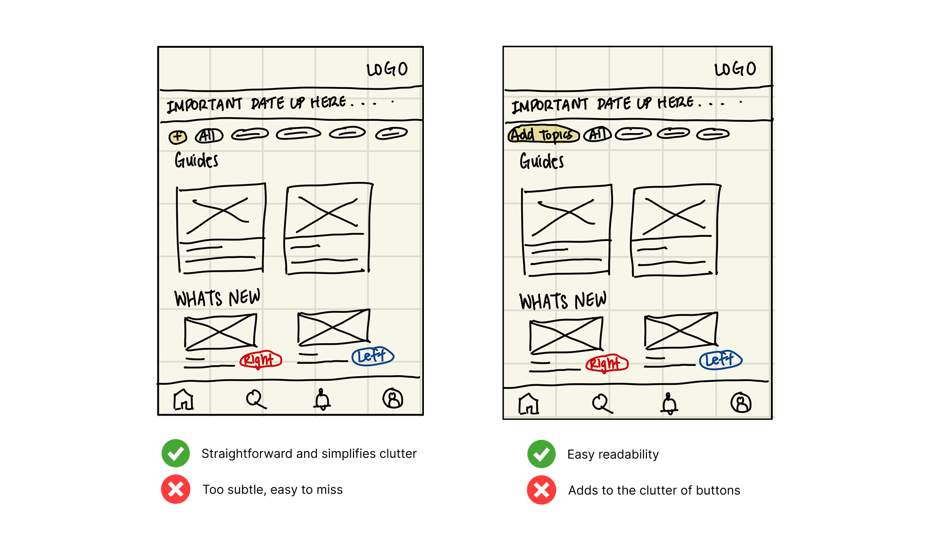
iteration and user testing
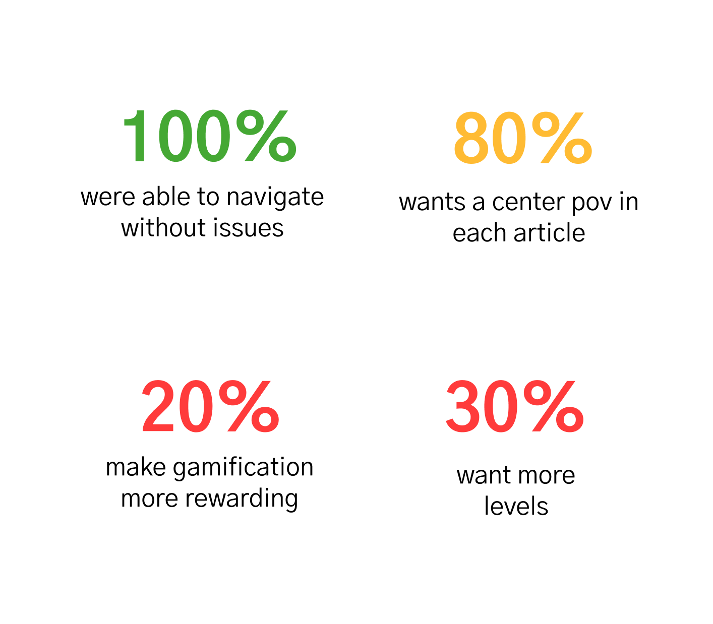
Using A/B testing, I asked the same 6 participants to compare the layouts and share their feedback.
Exploring two approaches for the "Add Topics" feature that allows users to add categories they want to follow
There were mixed reactions for both layouts. Half preferred the left layout due to its simplicity and the other half felt that the right-hand layout works better because of its readability. Upon reflection, I ultimately chose to use the left layout for adding topics. For the sake of this design, simplicity is my priority and eliminating any unnecessary clutter would be ideal.
What wording resonates with users the most?
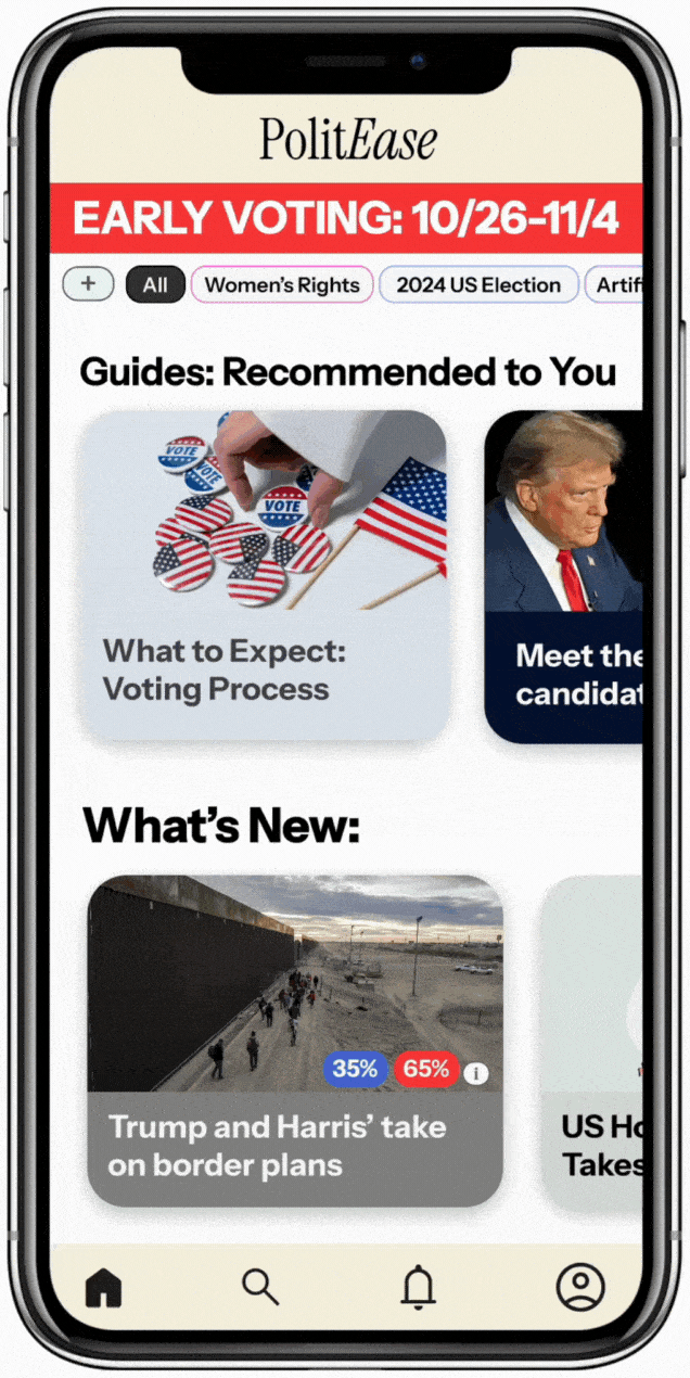
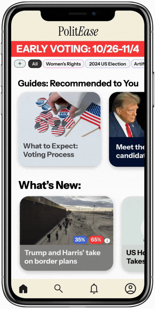
All users preferred "Guides: Recommended to You" because it felt more personal and human. The phrasing gave the impression that the content was directed toward them, which aligns well with the purpose of guides.
Do users support designing the homepage to adapt to their familiarity level with the platform?
Users supported this layout because it is effective in contextualizing politics for individuals with limited familiarity. In fact, having this feature makes it easier for them to engage with the material and become confident in navigating politics.
Other notable feedback that was not mentioned previously...